GrossGrowth
view the app01Category
App
02Date
2025
03Platform
Web, iOS, Android
GrossGrowth started as a simple idea: make personal finance feel calm and usable.
The goal was a visual language that feels fresh, intuitive, and trustworthy. A clean, minimalist design, where every element is intentional. Managing money should feel simple and effortless, not overwhelming.
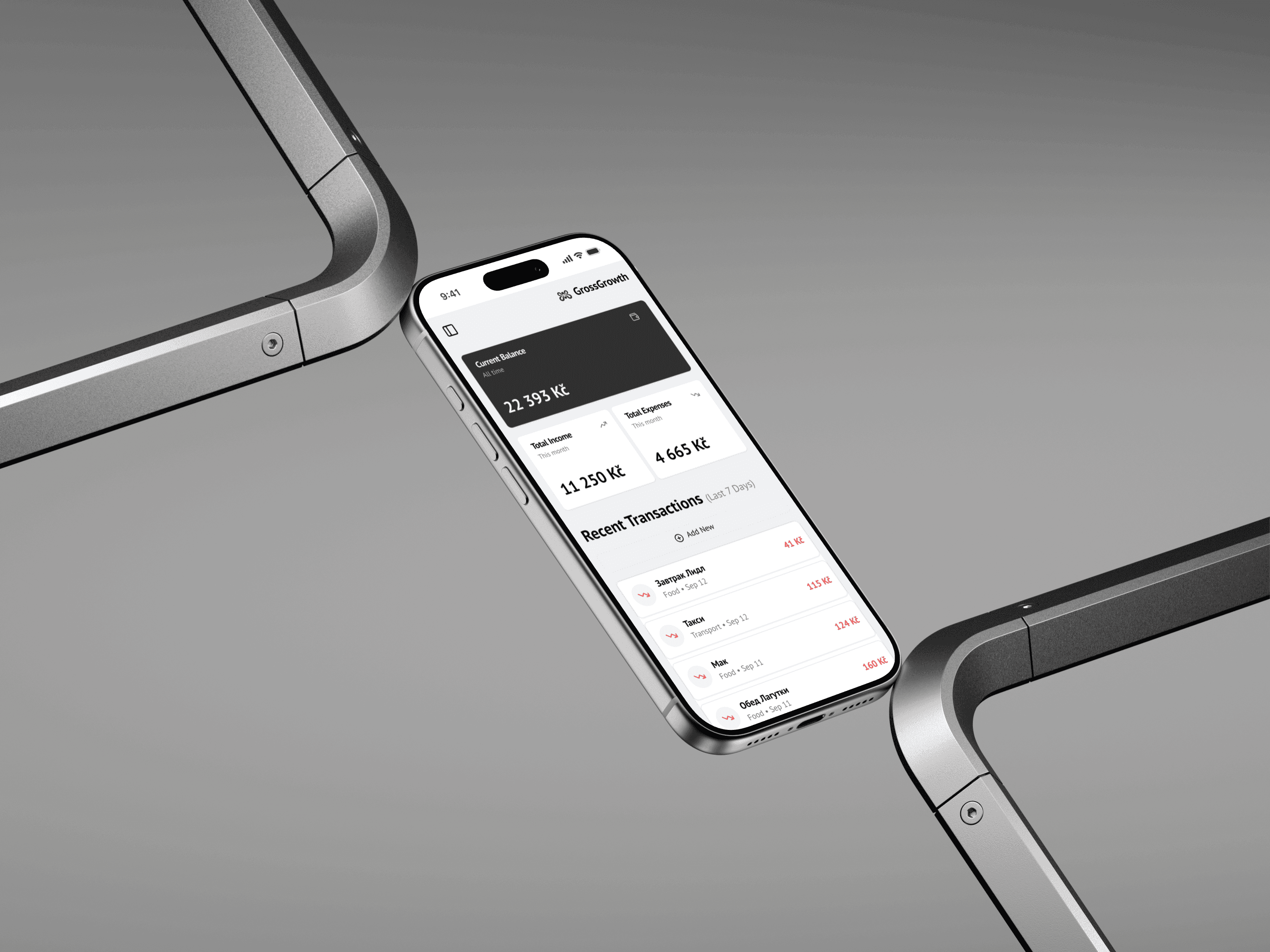
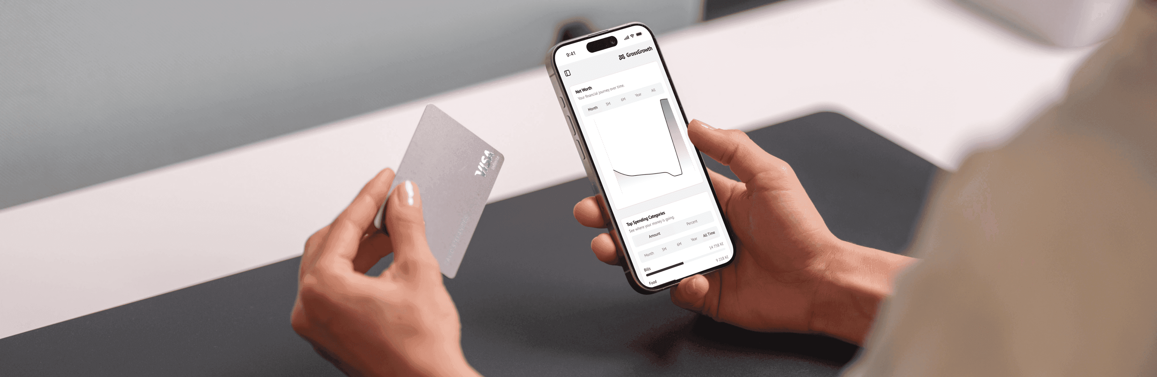
Cross-platform design
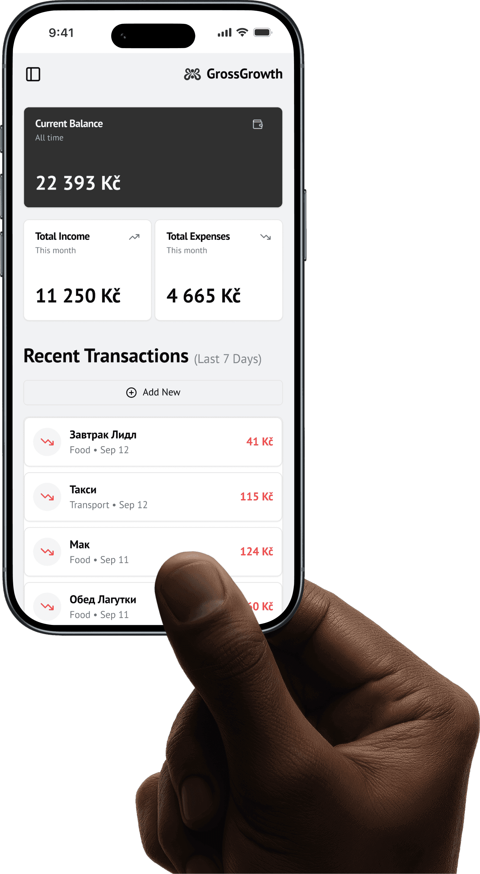
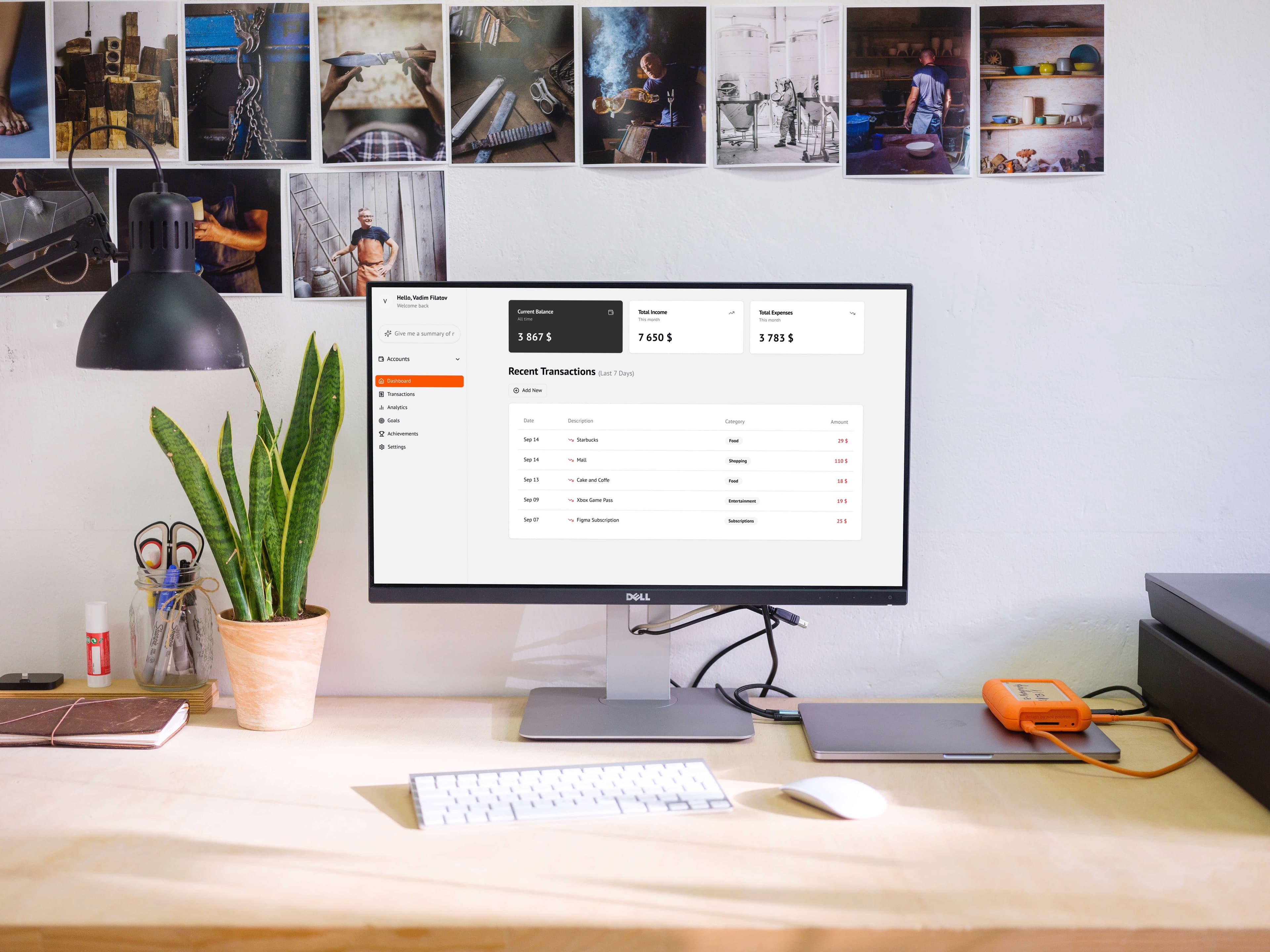
One design system, three surfaces. The same hierarchy on iOS, Android, and the web, so the product feels like one place no matter the screen.
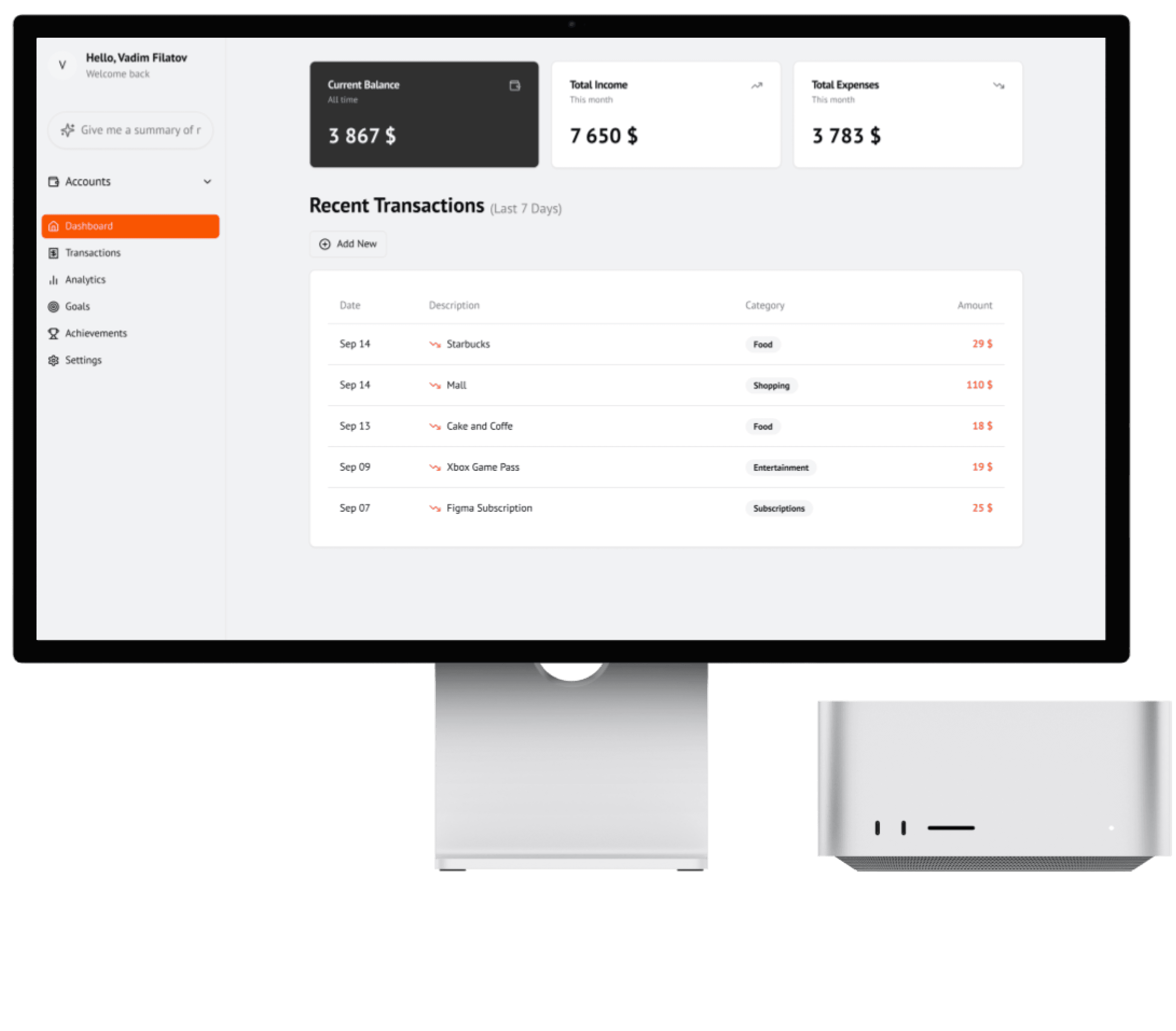
Balance, income, and the last payments stay in the same order. A person who learned it on the phone does not have to learn it again at a desk.
A language for the numbers
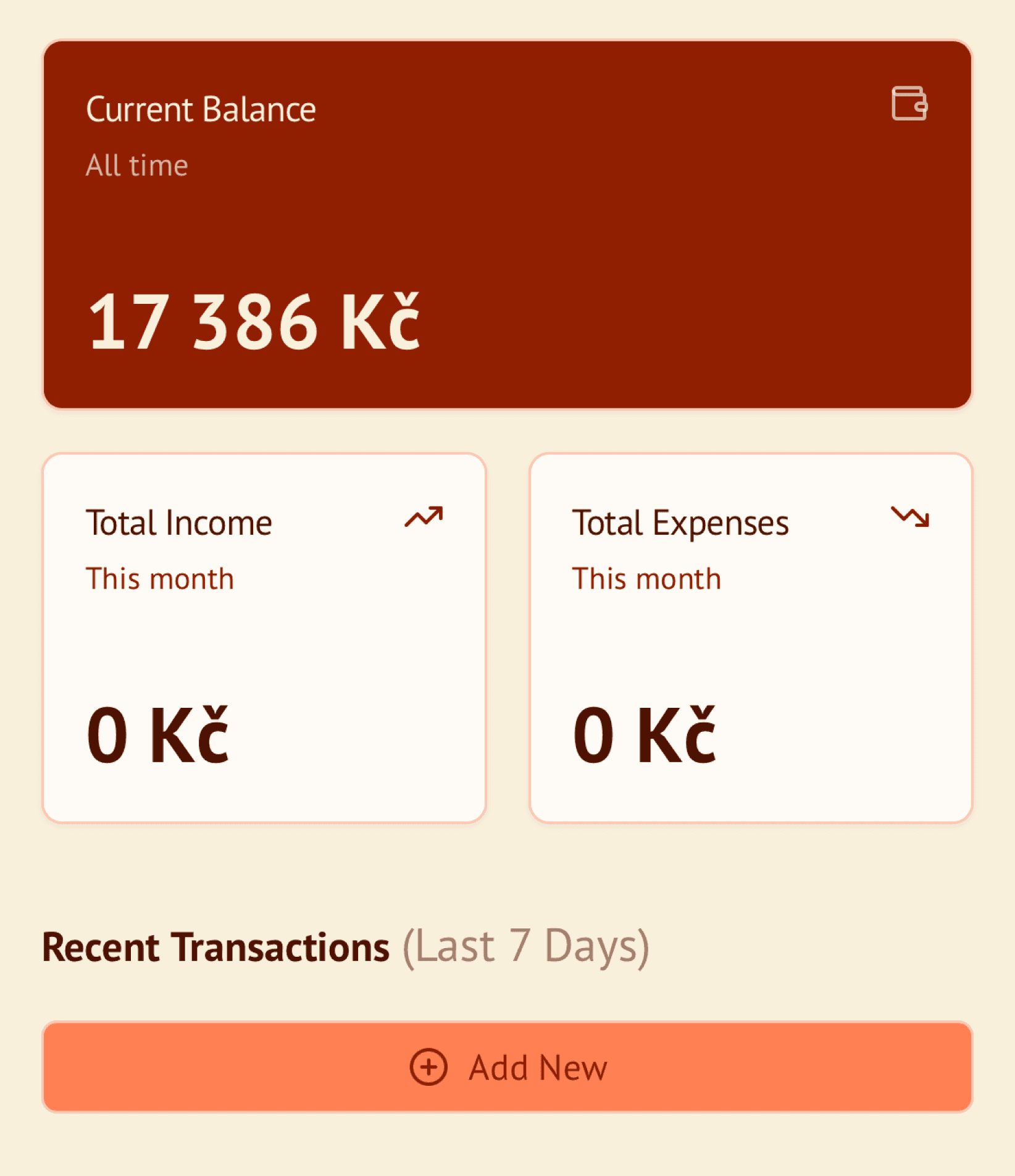
Home has to answer how am I doing before the person scrolls. Current balance, income, expenses, then the last few payments.
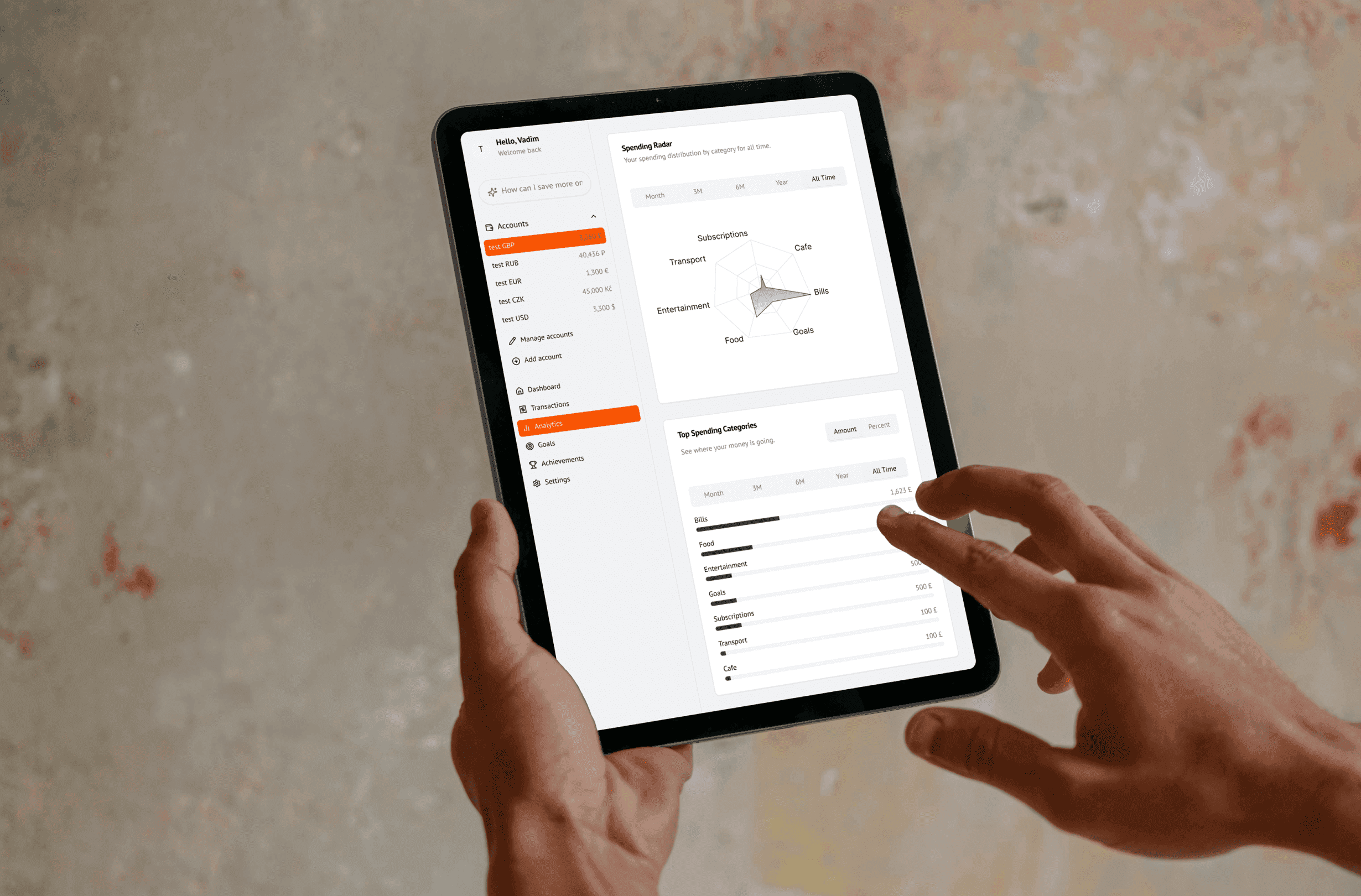
Analytics is the same language, opened up: net worth over time, the categories that take the most, and a radar of the whole picture. Dense data. A quiet screen.
Animation
Motion serves the person using it. Smooth transitions reduce friction. Micro-interactions give a little tactile confidence, and the movement points at the next step.
The result is finance management that feels like the product is leading you forward.
Colors
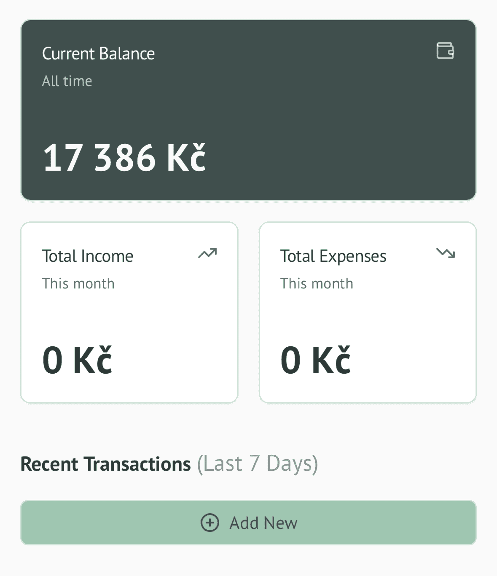
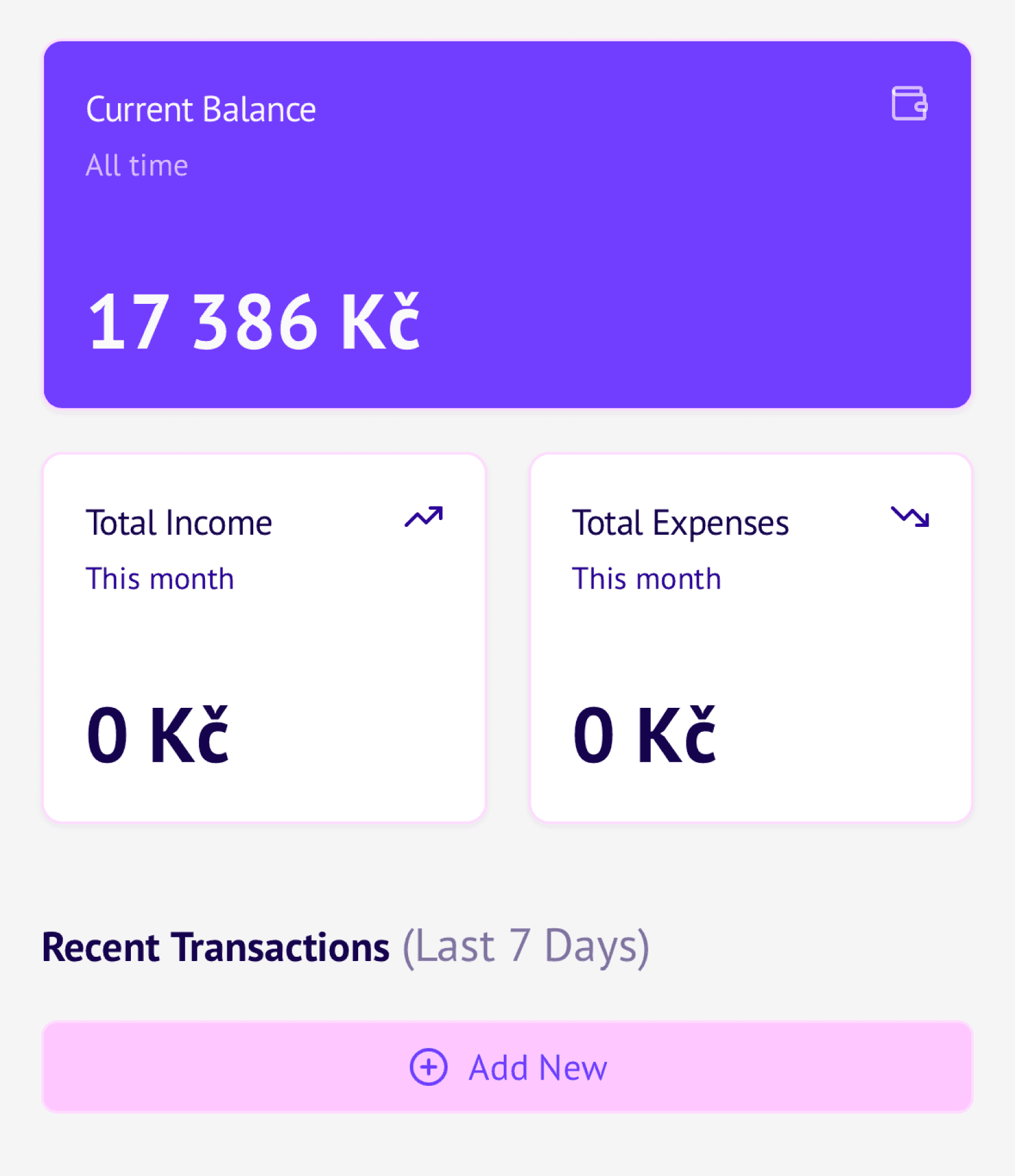
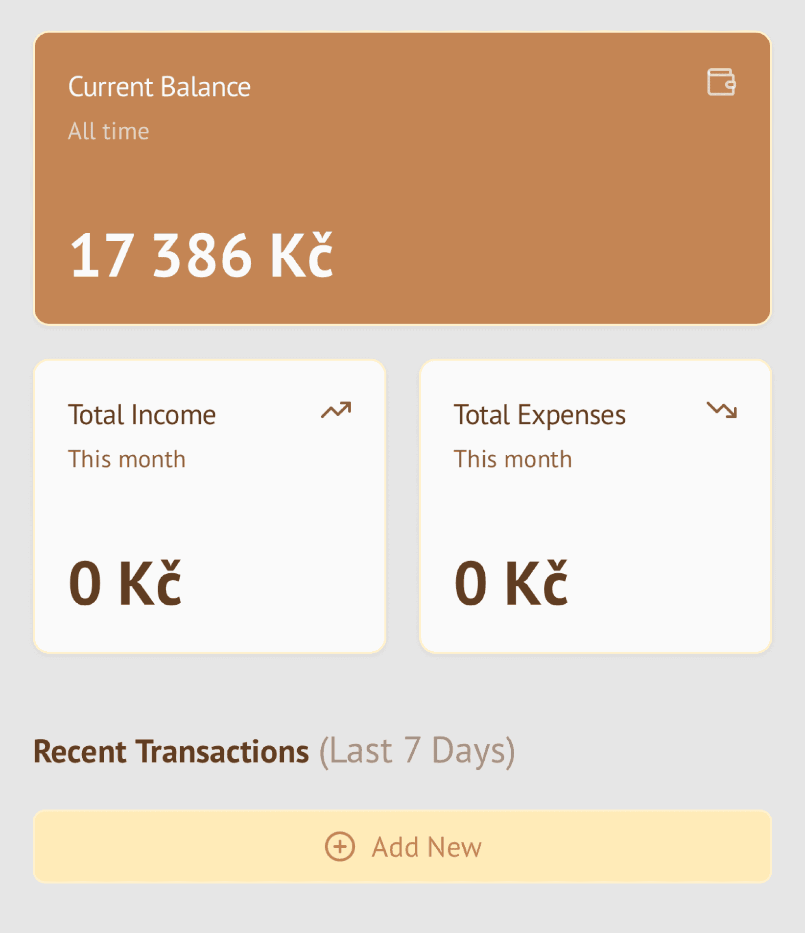
Themes change the mood without changing the product's logic.
Default stays neutral and clear for everyday use. Swamp is soft greens, less glare, calm focus. Neon uses purple and neon pink to highlight actions. Halloween is warm oranges and dark tones for the evening. Rustic is natural neutrals and honey browns for long sessions.
Contrast and states stay consistent across every mode.
Better focus
Along the way, every decision - layout, color, motion, AI - followed one rule: reduce friction, reveal meaning.
The interface stays consistent across themes, scales with real data, and gives just enough insight to act without hesitation. It is not about more features. It is about better focus. If it helps one person feel in control of their money every day, the design did its job.